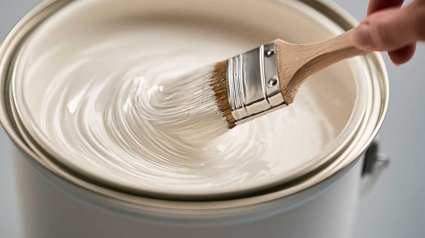
White is sold as the “safe” choice — neutral, bright, timeless. Yet almost everyone who has painted a wall white has had the same unsettling experience: the color looked perfect on the swatch, and completely different once it dried across an entire room. Sometimes it leans warm and creamy. Sometimes it turns cold and flat. Sometimes, months later, a once-crisp white door or skirting board quietly turns yellow for no obvious reason at all.
None of this means the paint is faulty. White is actually one of the most technically complex colors to formulate and apply well, because it’s never truly “colorless.” What follows is a complete breakdown of why white paint shifts in appearance — covering pigment chemistry, lighting physics, surface reflection, and the ageing process — along with practical guidance on choosing and applying white paint so it stays true to what you intended.
Every White Has a Hidden Undertone
No commercial white paint is a completely neutral, colorless base. Manufacturers add trace amounts of tinting pigment to their white bases to achieve a particular character — and that trace color is called an undertone. It’s usually invisible on a paint chip but becomes obvious once spread across a large wall surface, where light has more area to interact with the pigment.
| Undertone Family | Common Additives | Visual Effect | Best Used In |
|---|---|---|---|
| Warm (yellow/cream/beige) | Trace yellow oxide, red oxide | Soft, cozy, slightly ivory | North-facing rooms, traditional interiors |
| Cool (blue/grey/violet) | Trace blue, black, violet | Crisp, clean, sometimes clinical | South-facing rooms, modern/minimalist interiors |
| Green-grey | Trace green, black | Earthy, calm, can look dull in low light | Rooms with heavy natural greenery outside |
| “True” or neutral white | Balanced trace pigments | Closest to neutral, but rare | Galleries, studios, high-CRI lighting environments |
This is why two “white” paints from different brands — or even two whites from the same brand’s range — can look nothing alike side by side. Pairing a warm white next to a stark, cool-toned trim will make both undertones look more exaggerated than if either were used alone, because the eye judges color relative to its neighbors, not in isolation.
Lighting Is the Biggest Variable
If undertone is the paint’s built-in personality, lighting is what brings it out — and it’s the single biggest reason a color looks different at 9 a.m. than it does at 9 p.m.
- Warm light sources (incandescent bulbs, halogen, and warm-white LEDs rated around 2700K–3000K) amplify yellow and cream undertones.
- Cool light sources (daylight LEDs and fluorescents rated 4000K–6500K) pull out blue and grey undertones, sometimes making a warm white look strangely flat.
- Low or indirect light — hallways, north-facing rooms, or spaces with small windows — tends to make any white look muddier and greyer simply because there isn’t enough light bouncing off the surface to read as “bright.”
Room orientation compounds this effect:
- North-facing rooms receive indirect, cooler daylight and tend to make white paint look cooler and greyer than expected.
- South- and west-facing rooms receive stronger, warmer direct light for more of the day, intensifying yellow and cream undertones.
- East-facing rooms shift between the two — cool and bright in the morning, warmer and dimmer by evening.
This is precisely why a paint that reads as “brilliant white” under a store’s bright, neutral showroom lighting can look distinctly warm or cool once it’s on your own walls, under your own light bulbs, at your own room’s orientation.
Reflected Color From the Surroundings
White surfaces are highly reflective, which means they don’t just show their own pigment — they pick up faint color casts from everything around them. This is sometimes called “color bounce” or “color flare.”
- Wood flooring reflects warm amber and brown tones upward onto white walls.
- Gardens, trees, or green lawns outside a window can throw a faint green-grey tint onto interior white surfaces, especially near large glazing.
- Dark furniture, rugs, or curtains absorb light rather than reflecting it, which can make an adjacent white wall look dimmer or less crisp by contrast.
- Bold accent walls nearby can visually “borrow” undertones from the white, making it look tinted or uneven even though the paint itself hasn’t changed.
Because of this, choosing a white paint is really a decision about the whole room — flooring, furnishings, window aspect, and lighting — not just the paint tin on its own.
Surface Texture and Sheen Level
The finish of the paint changes how much light it reflects, and therefore how “white” it reads:
| Sheen Level | Light Reflectance | Typical Appearance | Best For |
|---|---|---|---|
| Matt / Flat | Low (absorbs light) | Softer, can look slightly grey in low light | Ceilings, low-traffic walls |
| Eggshell / Low Sheen | Medium | Balanced, hides minor wall flaws | Living rooms, bedrooms |
| Satin | Medium-high | Brighter, undertones more visible | Kitchens, hallways, high-traffic areas |
| Silk / Semi-gloss | High | Brightest, but emphasizes every undertone and surface flaw | Trim, doors, skirting boards |
| Gloss | Very high | Maximum brightness and undertone visibility | Doors, cabinetry, statement trim |
Uneven or textured walls compound the issue: shadows cast into dents, plaster texture, or poor patch repairs can make sections of an otherwise identical white look patchy or grey, independent of the paint itself.
The Chemistry of Yellowing Over Time
Beyond undertone and lighting, some white paints genuinely change color chemically after they’ve dried — a process separate from how the color is perceived and rooted in the paint’s actual molecular structure.
Oil-based and alkyd enamels are the most prone to this. These paints don’t dry through simple evaporation — they cure through oxidation, where the oil or resin binder chemically reacts with oxygen in the air and polymerizes into a solid film. This oxidation process continues long after the paint feels dry to the touch, sometimes for months or years. As it continues, it produces light-sensitive compounds called chromophores — molecules that absorb blue and violet wavelengths of light and reflect back yellow. The less daylight a surface receives (inside cupboards, behind furniture, on the underside of shelves), the more these chromophores accumulate rather than being bleached out by UV exposure, which is why yellowing is often worse in dark, enclosed, or low-light areas than on a bright, sun-exposed wall.
Water-based acrylic and latex paints are far less prone to this because they cure primarily through water evaporation combined with a synthetic resin binder, rather than oxidation of oils. This is why most modern “non-yellowing” paint ranges are water-based enamels and acrylics rather than traditional oil-based formulas.
Environmental pollutants, tobacco smoke, cooking residue, and general airborne grime can also cause a yellowish or grey film to build up on painted surfaces over years, which is sometimes mistaken for the paint itself discoloring.
| Paint Type | Yellowing Risk | Cure Method | Typical Durability | Indicative Price (per litre) |
|---|---|---|---|---|
| Oil-based / alkyd enamel | High | Oxidation (slow, ongoing) | Very hard, glossy finish | $$–$$$ |
| Water-based acrylic / latex | Low | Water evaporation + resin | Good, flexible finish | $–$$ |
| Water-based enamel (e.g., premium non-yellowing ranges) | Very low | Water evaporation + hard resin | Very hard, near-enamel finish | $$$ |
| Two-pack polyurethane (solvent-based) | Very low | Chemical cross-linking | Extremely hard, “mirror” finish | $$$$ |
Prices vary significantly by brand, region, and finish; use this table as a relative comparison rather than an exact price guide.
Old Colors Bleeding Through
A new coat of white paint isn’t immune to what’s underneath it. Skipping a proper primer — especially over previously dark, saturated, or warm-toned walls — allows the old pigment to migrate slightly into the new topcoat as it dries. This is known as bleed-through, and it typically shows up as:
- A faint yellow or beige cast where a warm color used to be
- A dull, greyish tint where a dark or saturated color was previously applied
- Patchy or uneven coverage, especially around repaired or patched sections of drywall
A high-quality stain-blocking primer is the single most reliable fix for this issue. It seals the old surface, prevents pigment migration, and gives the new white paint an accurate, uniform base to develop its true undertone on.
How to Avoid White Paint Surprises
A few practical rules of thumb:
- Test large sample areas, not just a paint chip. Paint at least a 2ft x 2ft patch directly on the wall.
- Observe the sample across a full day — morning, midday, and evening light will each reveal a different undertone.
- Match the undertone to your room’s orientation and existing fixed finishes — flooring, countertops, and large furniture pieces.
- Always prime dark or previously colored walls with a proper stain-blocking primer before applying white.
- Choose water-based acrylic or water-based enamel formulas in areas with low natural light — cupboard interiors, hallways, and doors — where yellowing from oxidation is most likely to appear over time.
- Don’t assume “brilliant white” is neutral. Marketing names rarely reflect the actual undertone; check the manufacturer’s undertone or “LRV” (Light Reflectance Value) data where available.
- Match sheen to function, not just aesthics — higher sheens amplify both brightness and undertone, so a hallway white in gloss will look noticeably different from the same white in matt.
Frequently Asked Questions
No. Genuine chemical yellowing is mainly a property of oil-based and alkyd enamels, caused by their oxidative curing process. Most modern water-based acrylics and enamels resist this almost entirely, though they can still appear to shift in tone due to lighting, dirt buildup, or undertone effects rather than true chemical change.
Not on the existing film. Chemical yellowing in oil-based paint is generally permanent. The standard fix is to lightly sand the surface to remove gloss and dull the yellow tone, then repaint with a non-yellowing water-based topcoat.
This is almost always a lighting and undertone issue rather than a chemical one — matt finishes absorb light and can look greyer in rooms with limited daylight, especially with cool-toned undertones.
Generally, yes. Premium water-based enamels and two-pack polyurethane systems are formulated specifically to resist yellowing and tend to cost more per litre than standard oil-based enamels, but they also last longer and hold their finish better over time.
The Bottom Line
A white wall that looks “off” almost never means the paint was a poor choice — it usually means one of four things is at play: an undertone that wasn’t obvious on the swatch, lighting that’s drawing that undertone out, reflected color from the room itself, or genuine chemical ageing in an oil-based formula. Testing large samples under real lighting conditions, priming properly, and choosing a water-based formula where yellowing is a concern will solve the vast majority of “why does my white look wrong” problems before they ever happen.
Happy Designing!
Share Why Do Some White Paints Look Yellow or Grey? with your friends and leave a comment below with your thoughts.
Read Can You Mix Warm and Cool Lighting in One Room? until we meet in the next article.