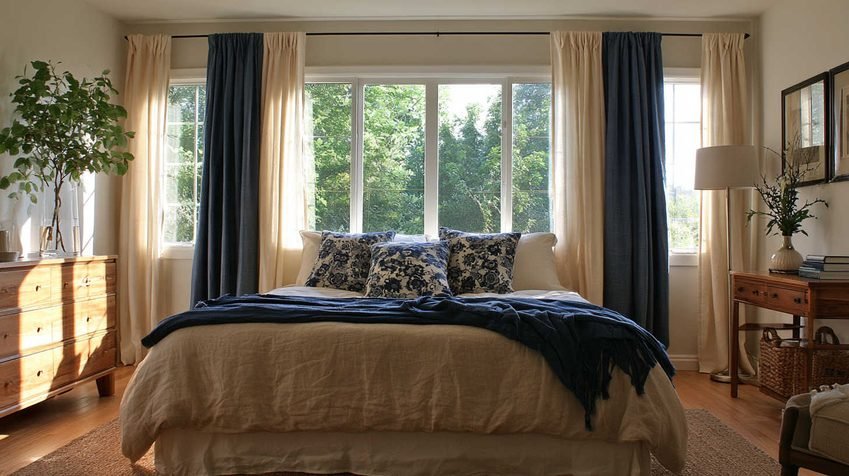
Curtains that match your walls exactly can look flat, because the window blends into the wall and the room loses its focal edge. Curtains in the same color family, one or two shades lighter or darker than the walls, avoid this. They keep the room calm and cohesive while adding depth. Texture, fullness and mounting height matter as much as the color you choose.
This guide covers when matching works, when it doesn’t, and how to choose the right color, fabric and size for each room.
Quick Answer: Match or Contrast?
| Approach | Best For | Effect | Risk |
|---|---|---|---|
| Exact match | Small rooms, minimalist spaces | Seamless, calm, taller-looking | Can look flat or unfinished |
| Tonal (1–2 shades off) | Most homes | Soft frame, depth, cohesion | Low, if you test samples |
| Bridge neutral (taupe, greige, flax) | Walls and floor with different undertones | Connects mismatched surfaces | Wrong undertone looks dull |
| Contrast or accent | Large rooms, statement windows | Focal point, personality | Can shorten or narrow the wall |
For most living rooms and bedrooms, the tonal approach is the safest choice.
Why Exact Matching Can Look Flat
Curtains are often the largest single area of fabric in a room. When they match the wall, the eye reads wall and window as one continuous surface. That has some benefits:
- Height: uninterrupted vertical lines from ceiling to floor make a room feel taller.
- Calm: fewer visual breaks reduce clutter in busy rooms.
- Forgiveness: small gaps in curtain drop or wall straightness disappear.
The downside is that the window loses its definition. A flat curtain on a flat wall with no texture, folds or tonal shift reads as a painted rectangle rather than a soft furnishing. Fabric also behaves differently from paint. Folds create shadow, so curtains usually look one or two shades darker than the flat swatch.
High contrast has its own problem. A dark curtain on a pale wall creates two strong vertical edges either side of the window. This visually narrows the wall and can shorten the room. That works in a large, well-lit space but is harder in a compact one.
The One-Shade Rule
The most reliable approach is to choose a curtain color in the same family as the wall, one or two shades away.
- Lighter curtains make a room feel open, bright and airy. They suit small rooms and rooms with limited daylight.
- Darker curtains add weight and intimacy. They suit bedrooms, dining rooms and large living rooms.
This slight difference gives the window a clean frame without breaking the color scheme.
Wall-to-Curtain Pairing Guide
| Wall Color | Lighter Curtain Option | Darker Curtain Option |
|---|---|---|
| Warm white | Ivory, soft white | Oatmeal, flax |
| Cream | Ivory linen | Sand, warm taupe |
| Beige | Off-white | Mushroom, stone |
| Light gray | Dove gray, pale stone | Charcoal-gray, slate |
| Sage green | Pale sage, linen | Deep olive |
| Navy or deep blue | Slate blue | Ink or midnight |
Texture Matters More Than Color
When curtains sit close to the wall color, texture does the work that contrast would otherwise do. Woven or slubbed fabrics catch light differently across the surface. That creates subtle variation without adding another color.
Fabric Comparison
| Fabric | Look | Light Control | Best Rooms | Typical Price* |
|---|---|---|---|---|
| Linen or linen-look | Relaxed, natural texture | Light to medium | Living rooms, bedrooms | $25–$90 per yard |
| Cotton (slubbed) | Casual, soft folds | Medium | Living rooms, nurseries | $12–$40 per yard |
| Velvet | Rich, deep, formal | Heavy, good insulation | Living rooms, dining rooms | $30–$120 per yard |
| Sheer (voile) | Airy, diffused | Very light | Layering, sunrooms | $6–$25 per yard |
| Blackout-lined | Smooth, structured | Near total | Bedrooms, nurseries | $20–$70 per yard |
| Herringbone or woven blend | Subtle pattern, depth | Medium | Any tonal scheme | $20–$60 per yard |
*Approximate retail ranges for fabric alone. Ready-made pairs generally cost $30–$150 per pair. Custom-made curtains, including fabric, lining and labor, commonly run $150–$600 or more per window depending on size and fabric. Prices vary by region and retailer.
Weight matters too. Interlined or heavy-lined curtains create deep folds and improve insulation and sound dampening. Unlined or lightweight curtains fall crisply and let filtered daylight through, which suits rooms where natural light is limited.
Hang Curtains for Dimension
Sizing and mounting change how a curtain reads as much as its color does.
Curtain Sizing Specifications
| Element | Recommended Guideline |
|---|---|
| Rod height | 4–6 inches above the window frame, or close to the ceiling |
| Rod width | 8–12 inches beyond each side of the frame |
| Fullness | 2x the rod width for standard heading; 2.5x for sheers |
| Length | Just touching or 0.5 inch above the floor |
| Sill-length option | Only where a radiator or furniture blocks the window |
| Panels per window | Two panels give better symmetry and fold depth than one |
Mount high. A rod placed close to the ceiling draws the eye upward and adds apparent height. It also lets curtains clear the glass when open, so more daylight enters.
Add fullness. Curtains pulled tight across a rod look thin and flat whatever they cost. Panels with roughly double the width of the window fall in rich folds that add natural shadow and depth.
Go floor-length. Curtains that stop at the sill in a room with full-height walls look abrupt. Floor-length panels create a clean vertical line that connects wall and floor.
Check Undertones in Your Walls and Floor
Color choice starts with undertones, meaning the warm, cool or neutral bias hidden inside a paint or flooring color.
Wall Undertones
- Warm undertones look creamy, golden or peach in daylight.
- Cool undertones look crisp, blue, silver or violet.
- Neutral undertones sit between the two and are easiest to coordinate.
Grays and beiges need extra care. Some grays contain brown, which makes them warm; others contain blue or purple, which makes them cool. Two grays that look identical online can feel completely different at home.
Floor Undertones
- Warm floors: honey oak, walnut, terracotta, reddish wood.
- Cool floors: gray laminate, slate, whitewashed oak, blue-gray tile.
- Mixed floors: many boards contain several tones, so pick the secondary one.
Use a Bridge Neutral
When walls and floors have different undertones, a curtain that shares a tone with both connects them. Taupe, greige, flax and stone all work well as bridges. For example, warm taupe can link cream walls with cool-gray flooring, so the curtain relates to both without matching either.
Light, Aspect and Time of Day
Curtains hang directly against the light source, so lighting affects them more than most surfaces.
| Room Orientation | Light Quality | Best Curtain Tones | Avoid |
|---|---|---|---|
| North-facing | Cool, even | Warm neutrals, soft taupe, gentle cream | Cold grays (look flat and bluish) |
| South-facing | Strong, warm | Cool tones, crisp whites, pale fabrics | Deep warm colors (can feel heavy) |
| East-facing | Bright mornings, dim later | Light, adaptable neutrals | Very dark shades |
| West-facing | Warm evening glow | Richer, deeper tones | Yellow-cream (can look stale) |
Test samples properly. Hang them vertically against the wall, not flat on a table. Check them in morning light, afternoon light and under evening lamps. Because folds create shadow, the hanging color will read darker than the swatch.
Room-by-Room Guide
Living Room
Living rooms contain many competing elements: seating, a television, shelving and art. Tonal curtains let the window recede and reduce visual noise. Save your stronger colors for accent seating, cushions or a rug.
Bedroom
Bedrooms prioritize light control and calm. Choose curtains close to the wall color with a blackout lining, which typically blocks 99% or more of daylight. Coordinating with bedding can look cohesive here, since bedding is easy to swap.
Dining Room
Dining rooms are used mostly in the evening under artificial light, so richer, deeper tones work well. Contrast is less risky because the room isn’t lived in all day.
Kitchen and Bathroom
Practicality leads. Washable roller or Roman blinds, or short café-style curtains, suit areas near water and cooking better than full-length panels.
When Matching Furniture Makes Sense
Matching curtains to furniture instead of walls is a different intention, not a mistake. It works in three situations:
- Large, well-lit rooms with high ceilings. The room can absorb strong color at the window without feeling closed in.
- Windows with architectural merit, such as bays, tall sash windows or arched heads, where emphasis is the goal.
- Rooms at risk of feeling flat. Pale walls, floor, sofa and curtains together can read as unfinished. A stronger curtain color gives the scheme an anchor.
If you do match furniture, avoid an exact fabric copy. Use the same color in a different weave or slightly different depth. An identical fabric on curtains and sofa looks like a set, not a scheme.
Can You Mix Patterns and Solids?
Yes, as long as one color runs through everything. Some practical approaches:
- Pair a patterned curtain with a solid blind that picks up one color from the print.
- Use a stripe as trim on a floral curtain to tie two fabrics together.
- In open-plan spaces, use different but complementary fabrics to zone areas, such as a printed fabric in the kitchen and a coordinated solid in the dining area.
- Keep matching curtains within the same room where windows sit side by side. Mismatched panels next to each other tend to look unbalanced.
Common Mistakes to Avoid
- Hanging the rod too low. This makes ceilings look lower and restricts light.
- Choosing sill-length curtains in full-height rooms. They look abrupt unless furniture blocks the way.
- Matching everything. When curtains, cushions, throw and rug share one color and pattern, the room loses depth.
- Skimping on fullness. Thin, tight panels look cheap regardless of fabric.
- Choosing from a screen alone. Order samples first, especially before a custom purchase.
- Ignoring the floor. Flooring covers a large area and always affects the curtain color.
- Picking curtains first. Settle walls and major furniture first, then let curtains respond to them.
Budget Planning Snapshot
| Option | Approximate Cost per Window | Best For |
|---|---|---|
| Ready-made panels | $30–$150 per pair | Standard window sizes, tight budgets |
| Made-to-measure (basic) | $150–$300 | Non-standard sizes, good fit |
| Made-to-measure (premium fabric, interlined) | $300–$600+ | Statement rooms, long-term investment |
| Curtain rod or track | $15–$120 | Depends on length and finish |
| Professional installation | $50–$150 per room | Heavy curtains, ceiling mounts |
These are general estimates and vary widely by location, fabric and supplier.
Frequently Asked Questions
Either works. Aim for one or two shades away from the wall in the same tonal family. Lighter curtains open up a room, while darker curtains add coziness. Because folds appear darker than a flat sample, lighter is often the safer choice for small rooms.
White curtains suit bright rooms with cool light and crisp palettes. In warm schemes with cream walls they can look stark or slightly gray, so test them against the wall first.
Yes, if the walls and sofa already share a tonal family. One curtain fabric rarely bridges two strongly contrasting colors.
As close to the ceiling as the space allows, provided the curtains still clear the floor. A higher rod makes both the window and the room feel taller.
Plain or subtly textured curtains are more flexible as furniture changes. Use pattern where the window is the intended focal point and the rest of the scheme is quiet.
Ivory, oatmeal, flax, soft gray and pale stone all work. Match the undertone: warm whites suit cream or oatmeal, while cool whites suit soft gray or crisp white.
Final Takeaway
Curtains don’t need to match the walls exactly, and they usually look better when they don’t. Pick a color one or two shades away from the wall in the same family. Bridge mismatched floors and walls with taupe, greige, flax or stone. Then use texture, height and fullness to give the window depth. Test fabric samples at several times of day before you order.
Happy Designing!
Share Should Curtains Match Walls, or Does That Look Flat? with your friends and leave a comment below with your thoughts.
Read Why Do Some White Paints Look Yellow or Grey? until we meet in the next article.